
02-09-2022 - Case Study, Gear, Technology
Shot on VENICE: Giovani Lampassi and Ana Amortegui Illuminate BET’s “Twenties”
By: Suzanne Lezotte
For two people who had never met in-person, and yet were slated to shoot the second season of “Twenties,” the mutual admiration of each other’s work quickly became apparent. “I was in Atlanta working,” explained Ana Amortegui (“Black Lightning,” Blumhouse “Into the Dark,” “Good Girls,” “Full Tilt Boogie”), “so when I interviewed for ‘Twenties,’ our first meeting was through emails and zoom. We were both new on this show and it would be our first time working together.” Lead DP Giovani Lampassi (“Brooklyn Nine Nine,” “Mapleworth Murders,” “Veronica Mars”) admitted, “The first conversations were about who we had worked with, who did we know. I was coming off Season 1 of ‘Home Economics,’ started ‘Twenties,’ and when I wrapped ‘Twenties’ I went back to ‘Home Economics.’ I needed to keep my crew together, and since Ana was out of town on another show, her regular crew was already working, which allowed me to work the system.” For Amortegui, who is currently working on the second Season of “Resident Alien” in Vancouver, “I had worked with operator Paige Thomas, and a couple of people, but it was almost a whole new crew. Sometimes a new crew allows you to get a fresh take on working as a team. I knew that as long as we all worked together it would be amazing.”
Season 1 of “Twenties” already had a look in place, but when Amortegui interviewed for the job, she presented a look book she had put together. “The creator of the show and the producer really liked my vision,” she explained, “and once I met with Gio, we used the look book as a base to develop a new look for the show.”
Director Diego Valesco, who came on board after Lampassi had been hired, sat down with him about his expectations. “He told me, you and Ana are good at what you do, so I want to empower you to go as bold as you want, push the envelope. At this point, I had the show up and running prep-wise,” explained Lampassi.
Since Valesco wanted Los Angeles to be a character in the story, they had inspiration from the city. “The color and the contrast fit right in and complemented the look that I had proposed for the show, which included more bold and saturated colors,” explained Amortegui. “I knew that as the story evolved, the characters would grow and we could work with a lot more color.”

Photo: Ron Jaffe/BET
Since Season 1 had more pastel colors, the team felt really empowered to go bold. As a reference, Valesco gave them photos of Constantine Manus. She continued, “We utilized a lot of contrast and a more saturated look. We had many images and references, which gave us more freedom to serve the story. The story dictated what we needed to do. Even in framing, we wanted to go really low or high to show the different moments in the life of the characters.” Lampassi added, “For me, I really loved the saturation of ‘Do the Right Thing,’ and that’s what I wanted to capture. The color is the life of the show.”
Given that the first season was not shot on Venice, Lampassi knew that he wanted to make that shift. “I was using it on ‘Home Economics’ and I asked Ana if she wanted to use it and she said yes.” With a camera rental package from Keslow Camera, Lampassi decided to go with the Cooke S4s, and two sets of Primes for each camera. “I really moved away from using zoom lenses, because I love getting below 2.8 but I also like a classic look. With the Cooke S4s, you get a little softness to it but there’s a nice crisp flare, which is great. And Ana agreed they were a good choice,” he added. Since Amortegui was shooting her own show with Cooke S4s, she expressed how good the Cookes are with contrast, “but with a smooth rendering of the image. It exudes a softer and prettier look, and with the digital cameras, you want to make it a little bit more film-like.” The camera was set to X-OCN ST, given the studio requirements, and the aspect ratio was 16x9. “The sensor mode was Super 35, but we cropped to 16x9. Everyone wants 4K, but as soon as you go 16x9 [in S35 mode on VENICE], it’s 3.8K,” noted Lampassi. The show LUT was Rec 709, which was colored on set by DIT Aaron Biller. “Aaron was amazing,” said Amortegui, “Working with a 4K output that goes to my monitor, I can see the true image, which allows me to have so much more control over it. It’s really helpful to show your client what it’s going to look like, so they can trust you even more.”

Photo: BET
Working together, the two created a color arc for each character, “based on where they started and where they ended the season,” said Lampassi. “We also utilized the frame spatially with the character’s arc, to support it. For instance, with Marie, the night Chuck is out and she’s home alone, I tried to replicate the scene from ‘Ordinary People’ with Mary Tyler Moore as she sits at the table by herself. I had an idea in my mind of what I wanted the scene to look like, and I would Google like crazy to find images that would support what was in my head.” He also pointed out that “for me, I think of the skin tone as the foundation of the frame and you build off that. I feel the VENICE handles the contrast between light and dark skin, the replication of the skin tone is very real.”

Photo: BET
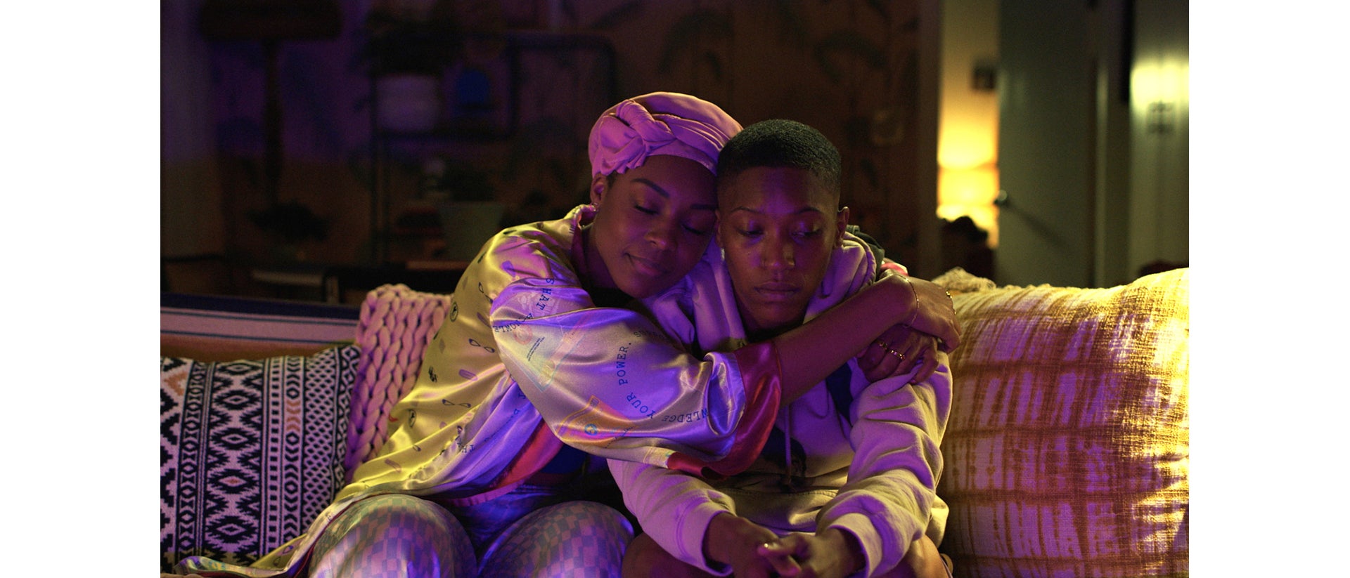
With Ida B’s character, Amortegui explained that she represents strength. “She’s straightforward, unbreakable and successful, so we agreed her surroundings had to reflect that. But we also had to freshen her look from Season 1, while keeping it clean and elegant. We used warmers colors for her, and particularly when she was with Hattie. This season we saw her falling for Hattie but she still had this superiority, so by giving her more space on the frame, we gave her more presence. Her space was bigger - big rooms - which lent itself to having more power when she was around.”
In the first episode of Season 2, Ida B fires Hattie and the two meet at her car in the parking lot. “I wanted to use a red backdrop,” explained Lampassi. “It’s not only a bold thing to do in terms of skin tone, but it’s technically challenging because you can’t pull focus on red, you need some kind of white light, so I knew that I had to use caution with it. Diego was directing that episode, and I pushed him to see it as a bit of a musical, that it doesn’t have to make sense. At the end of the day, I threw down the cinematic immunity card, and it worked!” he laughed. “My career is based on the belief that cinematography should always support the story, and that was an amazing episode.” Amortegui agreed. “Nobody questioned where that red came from. The scene was so sexy and magical, and without that lighting, it would have looked so different.”

Photo: BET
Color wise, Hattie is always bathed in reds, Nia in pinks and Marie in blues. When red showed up for Hattie, it portended something bad happening. In a critical scene where Ida B and Hattie have dinner in a restaurant that Hattie B rented out for the two of them, Amortegui used the location that doubled for a bar scene. “With the colors that Ida B and Hattie had, that was our base. But I wanted to show Ida B’s power and strength. The black reflected this very strong presence, and what is so beautiful about this shot is that you see these pops of yellow and orange,” she said. “I was inspired by the colors of the two characters, and in the storyline, the dinner doesn’t start the way it should, but we still need to show it is a romantic evening, so even though the black overpowers the red, the red stands out, and we utilized a fire in the background.” She shot that scene at 500 ISO, “and it was super dark. But I didn’t need anything else. The dual ISO is a winner, especially since we are always rushing, and with LED lights now such a big tool, we require less light to achieve the same as years ago. Maybe if I am shooting daylight, I’ll bump it to 2500, throw in an ND, since I don’t lose the depth I want to create when I don’t have time to light a big space. I can still get information in the shadows without having to light every corner of the room.” Lampassi agreed. “Going to 2500 from 500, there is so much dynamic range, even at 500, that I have pushed things further than I would ever push a film stock.”

Photo: BET
When Amortegui prepared for the bar scene with Nia and Ben, “I took a huge risk, because I used green on Nia, as she was starting to get closer to Ben,” she admitted. “Her colors were pink, but I wanted it to feel romantic, and make it exciting. The green represented Ben and in this case, red represented Nia; each of the colors reflecting their personalities in this storyline. The space we shot in had cream colors and was very plain. I wanted to make it feel special and different, so I created a whole mood based on those two colors. Gabrielle (Nia) is a goddess, so no matter what I color I used on her, I felt confident she was going to look beautiful. Also, given that we were shooting the restaurant scene in the same space, they had to look completely different.” Gaffer Joe Martens, “was very supportive with my creativity, and we decided to go for it.”

Photo: Ron Jaffe/BET
The color palette also came in handy when Amortegui shot Marie and Chuck’s engagement party. “I wanted it to resemble a high-end fashion look. I was backlighting them with strong HMIs to give them that refined look. The venue was very nice, overexposed, with hard lights, and the VENICE handled it beautifully. The NDs were a great advantage, when everything is outside and you have to control so much, it helps. There was a color palette as well, with the production designer. The crane shot in the beginning sets the tone of a big house, even though it was a small house with a small yard. It was a team effort between all the crew to make it look very elegant, and fancy.” Lampassi added that he still considers ND as filtration. “Having the filters built into the camera is amazing. It’s fast, which is something I love, and it doesn’t change the look. It is a true ND to me.”

Photo: Ron P. Jaffe/BET
Amortegui expressed how grateful she was to have Lampassi as a partner. “As the main DP, he was an awesome leader, and we worked as a team. I think it shows when you work well together; it’s cohesive.” Lampassi gave kudos to Amortegui. “I lucked out that we were paired together, and I’m praying we get to work together again.” Noting that Waithe wanted something out of the ordinary, “There were no rules, “ said Amortegui. “They really cared about what we were doing, and wanted our input. It was a beautiful experience.”
“Twenties” is streaming on Prime Video, VUDU, Philo, Spectrum TV, BET and BET Plus and Apple TV.

Photo: BET


