
09-27-2021 - Case Study, Gear, Technology
Why Color Science Has Made Sony VENICE the Go-To Camera for Blockbusters and Indies Alike
By: SonyCine Team, No Film School

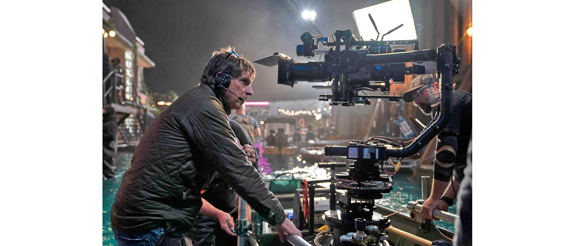
Director of photography PAUL CAMERON behind the scenes on Warner Bros. Pictures’ action thriller “REMINISCENCE.” Photo by Ben Rothstein
The DPs behind Reminiscence and Outer Banks share their creative process and a look at the low-light revolution.
From CODA to Loki, Reminiscence to Outer Banks, there is a surge of productions that have nothing in common visually other than one thing—Sony VENICE.
Why? It has to do with color science.
Paul Cameron, ASC, created the spellbinding looks of the futuristic, sometimes underwater world of neo-noir Reminiscence starring Hugh Jackman. Gonzalo Amat, ASC, evolved the dramatic look of action-adventure mystery Outer Banks to a bold second season.

HUGH JACKMAN as Nick Bannister in Warner Bros. Pictures’ action thriller “REMINISCENCE.” Photo courtesy of Warner Bros. Pictures
Inside the crazy production of Reminiscence, and why Paul Cameron needed Sony VENICE
When Paul Cameron initially sat down with first-time director Lisa Joy to talk about the unique script, the conversations about the analog romantic thriller were clear. The two referenced film noir and Body Heat, and how to create a rich environment set in the future.
Among other things, Reminiscence had an unusual challenge of needing symmetrical live projections of people's memories. Cameron ended up making a special cylindrical screen with 20K projectors to throw on a 45-degree angle that would be very dark compared to a reflective screen. This feature was one aspect that made Reminiscence a low-light challenge.
“As much as Lisa and I wanted to shoot on film, we gravitated towards the Sony VENICE,” said Cameron. “I'd shot some 2500-based material in the past and I felt comfortable shooting the scenes that we needed for Reminiscence at 2500 with live projections. Plus, I've shot a few movies with the VENICE and many commercials. It's just a go-to digital system for me because I just particularly like the log space and the color of the camera.”

Director of photography PAUL CAMERON behind the scenes on Warner Bros. Pictures’ action thriller “REMINISCENCE.” Photo by Ben Rothstein
Recently, SonyCine spoke with Paul Cameron about his decisions to use VENICE on both 21 Bridges and Reminiscence.
For Reminiscence, Cameron told us he chose Sony VENICE, because he needed “to shoot at a higher ISO and lower light levels for live projection. I knew it was the right camera for the film. The 2500 ISO base is extraordinary.”
For DIT Michael “Strawberry” Romano, 2500 ISO “is a magic bullet for the VENICE. For a night scene, we used 2500 and 500 for the close-ups, but when you put the Live Grain on top of it, you can’t tell the difference,” he explained.
Cameron commenting about deciding on VENICE for 21 Bridges: “When I tested the VENICE specifically for Westworld, which they were considering using for the whole show from my recommendation, what I saw was great color rendition at 500, where it was holding the subtleties of the color of eyes, for example, so I gravitated immediately toward the VENICE on 21 Bridges. And again, it was like opening a box of new film stock. Everything made sense about that camera - the internal filters, the 2500 base. I thought, "Okay, this is a great new tool that needs exploration."
“So with the combination of the VENICE and Live Grain, this was now going beyond the step of just emulating film or trying to get as good as film to where I actually now have a camera system that is better than film.”
On the film vs. digital debate: “After having tested VENICE on Westworld, film vs. VENICE, and you're really seeing comparative dynamic range… I'm not sitting up at the screen measuring it with a meter, but we're sitting there with a half dozen very well trained craftsmen and artists analyzing it, looking at different areas of fall off and color, contrast and resolution, film versus VENICE, and you think, "Okay, well that's really getting to a place where we can compare them realistically.”

Jackson Lee Davis/Netflix
In the linked article, No Film School spoke with both Cameron and Amat to talk about the process of creating those looks, and how color science, low light, and skin tones played a role in their use of Sony VENICE. Read full article HERE.
Links to our previous articles with Cameron about his work on Reminiscence: https://sonycine.com/articles/paul-cameron-asc-captures-the-futuristic-look-of--reminiscence-/


